
Why Your Bounce Rate Numbers Tell a Different Story
Let's clear the air about that bounce rate percentage you see in your analytics. It's easy to look at a high number and feel a sense of dread, but those figures don't always signal a disaster. The truth is, a "good" or "bad" bounce rate is entirely dependent on context—your industry, the type of content, and most importantly, what a visitor came to your site to do.
A high bounce rate isn't always a problem you need to fix. Sometimes, it just means you gave a visitor exactly what they wanted, quickly and efficiently. For instance, if someone searches for a specific answer and lands on your blog post, they might read it, get their answer, and leave. Mission accomplished! The real challenge is learning to tell the difference between a "happy bounce" and a visitor leaving out of frustration.
Decoding Visitor Intent
Before you can understand your numbers, you have to get inside your audience's head. A visitor landing on an e-commerce product page has a very different goal than someone landing on a contact page. One is there to browse and potentially buy, while the other just needs a phone number. Their engagement patterns will naturally be different, and so will their bounce rates.
This is why bounce rate benchmarks vary so widely. The average website bounce rate typically falls between 26% and 70%, but this is just a general guideline. Blogs often see bounce rates over 65% because visitors consume a single article and exit. In contrast, B2B sites usually have lower rates, often between 25% and 55%, because their audience is more targeted and looking for specific solutions.
To give you a clearer picture, I've put together a table with some common industry benchmarks. This can help you see where you stand and what a reasonable target might look like for your specific site.
Website Type | Excellent Rate | Good Rate | Needs Improvement |
|---|---|---|---|
E-commerce & Retail | 20% - 35% | 36% - 50% | 51%+ |
B2B & SaaS | 25% - 40% | 41% - 55% | 56%+ |
Blogs & Content Sites | 40% - 60% | 61% - 75% | 76%+ |
Landing Pages | 30% - 50% | 51% - 70% | 71%+ |
As you can see, what's considered "excellent" for a blog would be a red flag for an e-commerce site. Context is everything.
The infographic below shows how targeted improvements can dramatically affect these numbers.
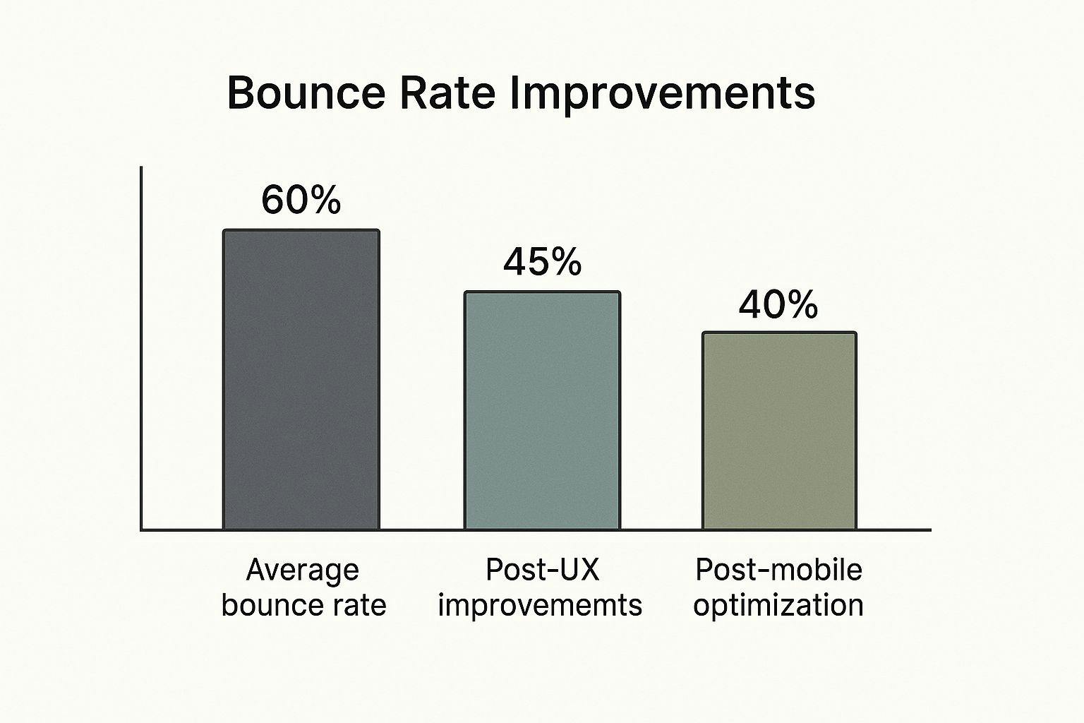
The visualization is a great reminder that focused efforts, like improving user experience (UX) and mobile optimization, lead to substantial reductions in bounce rate. It's clear proof that strategic changes have a measurable impact.
Ultimately, your bounce rate is just one piece of a much larger puzzle. It's a diagnostic tool, not a final grade. Also, it’s important not to confuse website bounces with email marketing bounces—they are completely different metrics measuring different things. If you're curious about the email side of things, you can learn more about what a bounce means in email marketing to avoid any confusion.
The Three-Second Rule: Making Speed Your Secret Weapon
In the world of user attention, seconds feel like hours. It's a hard truth for any website owner: visitor patience is incredibly thin. If your page takes more than three seconds to appear, a big chunk of your audience will be gone before they even see your headline. Research consistently shows that as page load time goes from one to three seconds, the probability of a visitor bouncing increases by 32%. This isn't just a small issue; it's a leak that can sink your engagement and conversion goals.
Knowing you have a speed problem is the first step, and thankfully, you don't need to be a developer to figure it out. Free tools can give you a clear, actionable report card on your site's performance.
Getting Your Speed Report Card
Tools like Google’s PageSpeed Insights provide a straightforward analysis of how quickly your site loads for both mobile and desktop users. They break down complex technical elements into a simple performance score and offer specific recommendations for improvement.
Here’s an example of what a PageSpeed Insights report looks like, giving you a clear score and diagnostic information.
This report immediately gives you a performance score and points to specific opportunities, like reducing the impact of third-party code or properly sizing images, which directly affect load time. Understanding these key metrics is crucial for figuring out how to lower your bounce rate.
High-Impact Fixes for a Faster Site
Once you have your report, you can focus on changes that deliver the biggest results without getting lost in the technical weeds. Think of it as prioritizing the heaviest items to lighten your site's load first.
Here are a few practical areas to focus on:
- Image Optimization: Large, uncompressed images are often the biggest culprits of slow load times. Before uploading, use a tool to compress your images. This can drastically reduce file size with almost no noticeable difference in quality. If you can, aim for modern formats like WebP.
- Rethink Your Hosting: Shared hosting is cheap, but you're also sharing resources with other websites. If your site is slow, it might be time for an upgrade. A better hosting plan provides more power, like moving from a crowded bus to a private car—it just gets you to your destination faster.
- Leverage Caching: Caching is like your website having a short-term memory. It stores parts of your site so that when a visitor returns, it doesn't have to reload everything from scratch. Most modern website platforms offer simple caching plugins or built-in features that can be enabled with just a few clicks.
By tackling these core issues, you directly address one of the most common reasons visitors leave. A faster, more responsive site creates a better first impression and encourages people to stick around and see what you have to offer.
Secrets From Sites That Master User Retention
What separates a website that visitors love from one they leave almost immediately? It's not just about a flashy design; it's about building an experience that feels natural and encourages people to stick around. The most engaging platforms are experts at guiding your attention, creating a "sticky" environment where one page flows logically to the next. They understand the thinking behind a click and use it to keep you engaged.

Think about a massive platform like YouTube. With billions of monthly visits, it maintains an impressively low bounce rate of around 34.29%, which is even lower than Google's. They pull this off by mastering the art of the "next step." You finish one video, and an algorithmically curated "Up Next" queue, personalized recommendations, and an endless scroll of related content are already waiting. The platform isn't just designed to answer your search; it’s built to spark new questions and curiosities. You can see how this strategy keeps users on-site by checking out more bounce rate strategies from top websites.
Translating Engagement Into Action
The good news is you don’t need a huge budget or a team of data scientists to use these same ideas. The core principle is simple: figure out what your visitor might want to see next and make it incredibly easy for them to get there.
Here’s how you can put this into practice:
- Strategic Internal Linking: Don't just throw links everywhere randomly. Place them where they genuinely answer a potential follow-up question. If a blog post mentions email deliverability, that's the perfect opportunity to guide readers. For instance, you could suggest they learn more about how to improve email deliverability in a more detailed guide.
- Clear Calls-to-Action (CTAs): Every page on your site should have a clear purpose. A distinct CTA like "Read Next Article," "Explore Our Services," or "Download the Guide" gives visitors direction. It reduces the chance they'll leave simply because they don't know what to do next.
- Related Content Sections: This is a simple but powerful tactic. At the end of a blog post or on a product page, always show similar articles or items. This is a great way how to lower bounce rate because it gives visitors a clear and relevant path forward instead of a dead end.
To really get a handle on keeping visitors around, it helps to look at the bigger picture. Exploring broader customer retention strategies can offer valuable ideas that go beyond just the initial website interaction, creating an experience that respects the user's time and attention.
Content That Hooks Visitors From the First Line
If your site speed is the handshake, your content is the conversation that follows. Even the quickest website will lose visitors if the content doesn't immediately deliver on its promise. Good content doesn't just inform; it grabs attention from the very first sentence and pulls the reader deeper into your site. This is a core part of figuring out how to lower bounce rate—turning a quick glance into a longer, more meaningful visit.

The trick is to answer the visitor’s main question as fast as you can. People are impatient. When they land on your page from a search engine, they have a specific problem to solve. If your opening paragraph is full of fluff and doesn't get to the point, they'll hit the back button without a second thought. I’ve found structuring articles with the most important information first, a style often called the "inverted pyramid," works wonders. This immediate value builds trust and gives them a reason to keep reading.
Crafting Content for Readability and Engagement
Once you've hooked them with a strong opening, the next challenge is making the rest of the content easy to digest. Huge walls of text are intimidating and a major reason people bounce, especially on mobile devices. Nobody wants to decipher a dense academic paper when they’re just looking for a quick solution.
Instead, you need to break your content into bite-sized pieces. This isn’t just about making things look pretty; it's about improving the user experience. Here are a few techniques that have always worked for me:
- Use Subheadings: Break your content into logical sections with clear H3 and H4 titles. This helps readers scan the page and jump to the parts they care about most.
- Keep Paragraphs Short: I aim for paragraphs that are just 2-4 sentences long. This creates more white space and makes the text feel less overwhelming.
- Incorporate Bullet Points: Lists are perfect for presenting tips, features, or steps. They are easy to scan and help communicate information quickly.
- Add Visuals: Relevant images, videos, and infographics can break up the text and explain complex ideas far better than words alone.
Creating Pathways with Internal Links
Finally, your content should never be a dead end. Every page should offer a clear next step for the reader. This is where strategic internal linking is so important. By embedding relevant links within your content, you create natural pathways that guide users to other valuable pages on your site.
For example, if you mention a related topic in a blog post, link to another article that explores it in more detail. This simple practice keeps visitors on your site longer and also signals to search engines that your content is well-connected and authoritative, which can give a nice boost to your SEO efforts.
Winning the Mobile Game Where Most Decisions Happen
Your mobile experience isn't just a shrunken version of your desktop site; it's a completely different arena where most of your bounce rate battles are fought. With nearly 60% of all web traffic now coming from mobile devices, a clunky mobile experience isn't just an inconvenience—it's a primary reason visitors will leave your site and never come back. The name of the game is speed, simplicity, and designing for an audience that’s far less patient than someone sitting at a desk.
Why Mobile Users Bounce Differently
A common mistake is thinking mobile optimization just means "making it fit on a smaller screen." In reality, mobile users have entirely different behaviors. They're often on the move, multitasking, and using their thumbs to get around. This means things that might be slightly annoying on a desktop—like complex menus, tiny buttons, or slow-loading images—become major deal-breakers on a phone, sending your bounce rate through the roof.
To give you a clearer picture, let's look at how bounce rates differ across devices for some major websites. This isn't just a minor variation; the data shows a significant gap in user retention between desktop and mobile.
Desktop vs Mobile Bounce Rate Performance
Comparison of bounce rates and engagement metrics across different devices for major websites
Website | Desktop Bounce Rate | Mobile Bounce Rate | Pages Per Visit |
|---|---|---|---|
27.29% | 36.31% | 7.92 | |
29.41% | 38.01% | 7.55 | |
Yahoo | 30.63% | 34.69% | 5.51 |
Wikipedia | 43.19% | 46.12% | 4.38 |
As the table shows, even for giants like Twitter, the bounce rate is nearly 25% lower on desktops. This isn't a coincidence. It highlights that keeping a mobile user engaged is a distinct challenge. You can dig deeper into website performance statistics across devices to see just how critical these differences are for yourself. Understanding this is key to lowering your bounce rate where it counts the most.
Actionable Mobile Optimization Tips
To succeed on mobile, you have to get laser-focused on what actually impacts the user. It's less about stuffing every feature onto a small screen and more about creating a fast, intuitive path to what your visitor wants.
- Prioritize Above-the-Fold Content: The very first thing a mobile visitor sees has to grab their attention. Make sure your main message and primary call-to-action are visible immediately, no scrolling required.
- Design for Thumbs: This sounds obvious, but it’s often overlooked. Ensure every button, link, and interactive element is large enough to be tapped easily. Nothing is more frustrating than trying to hit a tiny link and tapping the wrong thing five times.
- Simplify Navigation: A clean "hamburger" menu is your best friend on mobile. Avoid cramming in complex, multi-level dropdowns that are a nightmare to navigate on a touchscreen.
- Optimize Forms for Mobile: If your site has forms, keep them short and sweet. Use mobile-friendly input types that trigger the right keyboard—for example, a number pad for phone number fields. Every small convenience helps.
Design Choices That Guide Users Deeper Into Your Site
Good design is about more than just looking pretty; it's about creating invisible pathways that encourage visitors to stick around and explore. It’s the art of making a website so intuitive that moving from one page to the next feels like a natural, effortless discovery. This is a fundamental part of learning how to lower bounce rate, as it can turn a quick, single-page visit into a much longer, more meaningful session.
This whole process begins when you start thinking like a first-time visitor. When someone lands on your page, their eyes naturally follow a certain path. A strong visual hierarchy, created using different sizes, colors, and placements, tells them what’s important without you having to spell it out. By using plenty of white space, you can reduce clutter and make key elements, like a call-to-action button, really pop. This isn't just about looks; it's about reducing the mental effort so users can actually focus on your message.
Putting Guiding Design Into Practice
Creating these user pathways doesn't mean you need a massive site overhaul. In my experience, small, subtle changes can make a huge difference in how people move through your site and how long they stay. The main goal is to make the "next step" both obvious and appealing.
Here are a few practical techniques you can try:
- Organize Content Logically: A clean layout with clear, scannable sections helps visitors find what they need without getting frustrated. A cluttered page is practically begging for a bounce. I always recommend using subheadings and short paragraphs to make the content feel more approachable.
- Design Clear Calls-to-Action (CTAs): Your CTA buttons should be impossible to ignore. Use a color that contrasts with the rest of the page to draw the eye and write action-oriented text like “Explore Our Features” or “Read the Next Article.” Steer clear of vague phrases like “Click Here.”
- Place Related Content Strategically: At the end of a blog post or on a product page, always suggest what to check out next. This is one of the simplest yet most effective ways to lower bounce rates because it gives visitors a clear path forward instead of hitting a dead end.
By making these deliberate design choices, you’re actively guiding your visitors instead of leaving them to figure things out on their own. This thoughtful approach creates a more engaging experience, making sure users see more of what you have to offer, which is ultimately how to lower bounce rate for good.
Tracking Progress and Fine-Tuning Your Results
Making changes to your site is just one part of the puzzle. Now comes the moment of truth—finding out if your efforts are actually paying off. To really understand if you’re learning how to lower bounce rate, you have to look past that one number and dig into data that shows what users are really doing.
Key Metrics to Monitor
While your main goal is to get that bounce rate down, a few other metrics tell a much richer story about how people behave on your site. Keeping an eye on these gives you a more complete picture of your site's performance.
- Engagement Rate: In Google Analytics 4, this is basically the opposite of bounce rate. A higher engagement rate is a great sign that visitors are interacting with your site in meaningful ways.
- Average Time on Page: This one is straightforward: how long are people sticking around on a specific page? If they're spending a good amount of time, it usually means your content is hitting the mark and keeping their attention.
- Pages Per Session: Are visitors clicking around to other pages after they land? An increase here is a strong indicator that your internal links and site design are successfully guiding them deeper into your content.
- Conversion Rate: At the end of the day, you want visitors to take some kind of action. Tracking conversions, whether it's a purchase, a form submission, or a newsletter signup, is the ultimate measure of success.
A/B Testing for Continuous Improvement
You shouldn't have to guess which of your changes are making the biggest difference. A/B testing is your secret weapon for making decisions based on data, not just a gut feeling.
For instance, you could test two different headlines for a blog post or try out different button colors for a call-to-action. By showing each version to separate groups of your audience, you can see which one does a better job of keeping users on the page. This approach takes the guesswork out of the equation and gives you clear proof of what works for your visitors.
And while you're optimizing your site, don't forget the foundation of your digital efforts: a clean, deliverable contact list. If you're also working on your email campaigns, our guide on how to clean an email list can help you maintain high deliverability and keep your audience engaged.
Ready to stop guessing and start seeing real results? VerifyRight provides the tools you need to make sure every part of your marketing funnel is set up for success. Sign up for free today and begin improving your engagement from the ground up.