
Why Most Email Reports Are Collecting Digital Dust

Let's be real, how many email reports have you actually used lately? I'm guessing not many. I've chatted with a bunch of marketing managers, and the feeling is mutual: most email reports are just data graveyards. Sure, they might look fancy with all those charts and graphs, but are they actually helping you make decisions? That's the real question. This gap between data and doing something with it is a huge problem.
It's not that we don't have enough info, it's that we're drowning in irrelevant metrics. Before diving into fancy Automation ROI, think about what you're actually tracking. Are you measuring clicks just because your platform allows it, or are those clicks turning into actual sales? That's the key difference between simply collecting data and uncovering useful insights.
Email marketing itself is exploding, which makes smart reporting even more important. This industry is predicted to be worth a staggering $17.9 billion by 2027, a massive jump from $7.5 billion in 2020. With 82% of marketers worldwide using email to connect with customers, getting your reporting right is mission-critical. If you're not getting real value from your email data, you're essentially leaving money on the table. Check out these email marketing statistics for more context. In the next section, we'll dive into the metrics that truly matter for your business, setting you up for an email metrics report template that actually delivers.
Finding The Metrics That Actually Matter To Your Business
Let's be honest, not every email metric is worth your time. Some are just vanity metrics, making you feel good without actually telling you anything useful. Others are pure gold, offering real insights into customer behavior and guiding your strategy. From my experience, focusing on a core set of metrics makes a world of difference. Figuring out what those key performance indicators (KPIs) are is the first step to truly understanding the impact of your email reports.
Take a lead nurturing campaign, for example. Open rates can give you a peek into how well your subject lines are performing, but they don’t tell the whole story. Click-through rates, however, show how many people were actually intrigued enough by your content to click and learn more. Even better? Tracking actual conversions tied to your emails, like demo requests or content downloads. That’s where you see the real impact of your messaging.
The infographic below shows a typical breakdown of three key metrics: Open Rate, Click-Through Rate, and Bounce Rate.
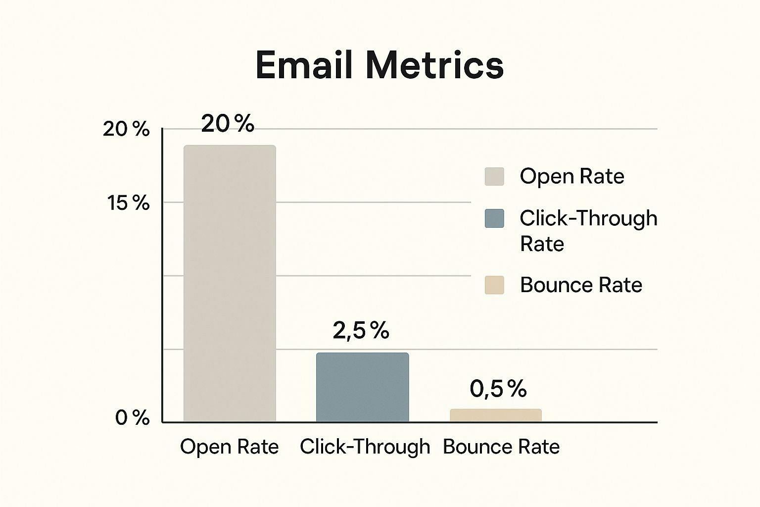
A 20% open rate might seem okay at first glance, but the 2.5% click-through rate suggests the content might not be resonating as well as it could with the audience. That low 0.5% bounce rate, though? That's a sign of a healthy email list. And a clean list makes a huge difference in campaign success. Keeping your list in top shape requires a solid email verification workflow.
Diving Deeper Into Email Metrics
Don't forget about metrics like unsubscribe rates and spam complaints. I know, they seem negative, but they offer invaluable feedback. High unsubscribe rates after specific emails can be a wake-up call that your content isn't meeting audience expectations. Likewise, a jump in spam complaints might highlight problems with your sending practices. By analyzing these seemingly "bad" metrics, you can spot areas for improvement and fine-tune your email strategies. The goal? Better engagement and deliverability, of course!
To help visualize this, I've put together a handy comparison table. It breaks down essential email metrics and contrasts them with some "nice-to-have" data that can add extra context.
Essential Email Metrics vs. Nice-to-Have Data
Comparison of critical email metrics that drive decisions versus supplementary data that adds context
Metric | Business Impact | Tracking Priority | Typical Benchmark |
|---|---|---|---|
Open Rate | Measures subject line effectiveness and audience interest | High | 15-25% |
Click-Through Rate | Shows content engagement and call-to-action performance | High | 2-5% |
Conversion Rate | Tracks the effectiveness of email in driving desired actions (e.g., sales, sign-ups) | Highest | Varies widely based on industry and campaign goals |
Bounce Rate | Indicates email list health and deliverability issues | High | < 1% |
Unsubscribe Rate | Signals audience dissatisfaction or content irrelevance | Medium | < 0.5% |
Spam Complaints | Reveals potential problems with sending practices or content perception | Medium | < 0.1% |
List Growth Rate | Shows the effectiveness of list-building efforts | Medium | Varies based on strategy |
Email Client Usage | Provides insights into audience device preferences and email client compatibility | Low | Useful for troubleshooting rendering issues |
Time of Open/Click | Helps optimize send times for maximum engagement | Low | Can inform scheduling strategies |
As you can see, prioritizing metrics like Conversion Rate, Click-Through Rate, and Bounce Rate can really help you steer your email strategy in the right direction. While other metrics can offer additional insights, focusing on the essentials first will provide the most impactful improvements to your overall campaign performance.
Crafting Reports That People Actually Want To Read

We've covered choosing the right email metrics. Now, let's make them really stand out. A great email metrics report isn't just a list of numbers, it's a story. Think of it as guiding your stakeholders through your findings. No one wants a data dump. Instead, use visual hierarchy to highlight what's important.
Designing for Clarity and Impact
I once worked with a client whose reports were overflowing with data, but the key insights were buried. We simplified the layout, using clear headings, bullet points, and concise summaries. The difference was night and day. Suddenly, the important information jumped off the page, and the reports actually started influencing decisions. It all came down to focusing on what truly mattered – leading with the most impactful metrics and backing them up with relevant data.
Knowing your audience is also key. An executive summary might only need the highlights, while a deeper analysis might require more detailed data. The sweet spot is giving everyone what they need without overwhelming them. This brings us to a critical point: data segmentation. Segmented email campaigns are more effective, and the same principle applies to reporting. Just like segmented campaigns lead to 30% more opens and 50% more clickthroughs (with 99% of users checking their inboxes daily!), segmented reports deliver more tailored insights. Learn more about email marketing statistics.
Using Visuals Strategically
Visuals are powerful tools. Choose charts and graphs that actually enhance understanding, not just complicated ones. A simple line graph showcasing trends can be much more effective than a cluttered pie chart. To truly grasp how your metrics translate into business value, it's helpful to look at the bigger picture of email marketing. Check out this resource on the advantages of email marketing.
Don't be afraid to experiment! Play around with different layouts, chart styles, and summary formats. What works for one audience might not work for another. And remember, a clean email list is crucial for accurate reporting. Our guide on how to clean your email list has some great best practices. By continually refining your approach, you'll create reports that people don't just read – they act on.
Mobile Performance Insights That Drive Real Improvements
Let's be honest, mobile email is where it's at. It's often the main way people interact with your campaigns, so your email metrics report template needs to reflect that. Don't bury mobile data – make it a star player.
Think bigger than just open rates. You need to understand how people use their phones to engage with your emails. Are they clicking through to your site? Even better, are those mobile clicks turning into conversions?
This is where mobile-specific metrics get really interesting. Knowing how mobile differs from desktop can totally reshape your strategy. For example, imagine a campaign with killer mobile opens but weak click-throughs. This might mean your emails look amazing on phones, but your call to action needs some mobile-friendly love.
Speaking of optimization, check this out: mobile clients snag 41.6% of email opens, webmail comes in at 40.6%, and desktop trails behind at 16.2%. Even more compelling? A whopping 75% of users prefer their smartphones for checking email. This stat alone screams how important it is to tailor both your reporting and your email design for mobile. Discover more insights on email statistics.
Visualizing mobile vs. desktop performance within your reports can highlight these differences. Instead of just comparing numbers, focus on the so what. What actions can you take based on this data?
This screenshot from Mailchimp shows how email templates can cater to different experiences:
The range of templates emphasizes the importance of optimizing layouts and content for various devices. Responsive design is your best friend here – ensuring your emails look sharp no matter the screen size.
Finally, don't forget about email deliverability. A hard bounce can throw a wrench in your metrics, impacting your overall performance. Dig deeper into hard bounces here. By carefully analyzing your mobile data, you can unlock hidden opportunities to make your emails even better.
Building Reports That Update Themselves
Manually building reports? Let's be honest, it's a productivity killer. Nobody enjoys wrestling with spreadsheets and data dumps. Plus, it’s prone to errors and eats up valuable time. Thankfully, there are much better ways to keep tabs on your email's performance. Automating your email metrics report template isn't just about saving time (though that’s a huge bonus!); it’s about getting cleaner, more reliable data that you can actually use.
Automating Your Workflow
First, think about how your current email platform connects with your reporting tools. Or, if it doesn't connect, how could it? The key is to make those integrations work for you, not the other way around. I've seen teams get bogged down in complex integrations that end up being more trouble than they're worth. My advice? Keep it simple, especially when you're starting out.
If you're comfortable in a spreadsheet environment, tools like Google Sheets offer great automation options for data imports and calculations. For example, you can connect your email platform to Google Sheets using Zapier or IFTTT. This lets you automatically pull in core metrics like open rates and click-through rates. Then, you can use that data to build basic reports right in your spreadsheet. It's an excellent starting point for teams with limited resources or who are just dipping their toes into automation.
Scaling Your Automation
As your reporting needs grow, you'll want to explore more robust solutions. Dashboarding platforms like Databox and Google Data Studio are game-changers. They can pull data from multiple sources (including your email platform) to create dynamic dashboards that update in real time. I've witnessed firsthand how these dashboards can transform a team's reporting, bringing everything from email performance to website traffic into a single, easy-to-understand view.
Before we get too excited, remember that automation isn’t a “set it and forget it” magic bullet. Data quality is paramount. Regularly check your reports for anything that seems off – inconsistencies or unexpected errors. For instance, a sudden jump in bounce rates could point to a deliverability issue, not necessarily that your audience is suddenly uninterested. Catching these problems early can save you a major headache down the road and ensures your email metrics report template remains relevant and accurate.
Speaking of tools, I've put together a quick comparison of some popular email reporting automation options. It highlights key features, pricing, and what each tool is best suited for. This should give you a good jumping-off point for your own research.
To help you navigate the options out there, here’s a handy comparison:
Email Reporting Automation Tools Comparison
Analysis of popular tools for automating email metrics reporting, including features, pricing, and best use cases
Tool | Key Features | Best For | Pricing Range | Integration Options |
|---|---|---|---|---|
Google Sheets | Formulas, charts, data import | Basic reporting, limited budgets | Free | Zapier, IFTTT, APIs |
Databox | Pre-built templates, custom dashboards, real-time data | Visual reporting, marketing teams | Starts at $72/month | Wide range of marketing and sales tools |
Google Data Studio | Customizable reports, data blending, interactive visualizations | Data analysis, agencies | Free | Google Marketing Platform, other Google products |
Microsoft Power BI | Advanced analytics, data modeling, enterprise-grade security | Large organizations, complex data sets | Starts at $10/user/month | Microsoft ecosystem, other data sources |
This table highlights the variety of tools available, from free spreadsheet solutions to powerful enterprise platforms. Choosing the right one depends on your specific needs and budget.
By striking the right balance between automation and careful monitoring, you can build reports that not only free up your time but also deliver the accurate, actionable insights that drive success.
Turning Data Into Decisions Your Team Will Act On
The best email metrics report isn't about fancy charts and graphs; it's about making real changes to your email campaigns. The most effective marketing teams design their reports to highlight important trends, pinpoint opportunities, and offer clear, actionable recommendations.
Think about it: a report full of interesting observations is useless if nobody knows what to do with the information. You want data that naturally leads to actionable conclusions. How? By showcasing what's working, what's not, and – this is key – what the next steps should be.
I've personally seen companies completely overhaul their email performance just by shifting how they approach reporting. They stopped thinking of reports as just a record of the past and started using them as a strategic tool for continuous improvement. For example, I had a client struggling with low click-through rates. By digging into their email metrics and segmenting their audience, they discovered a particular customer group just wasn't engaging with their content. This led them to tailor specific email content for that segment, which significantly boosted click-throughs and conversions.
From Insights to Action
So, how can you achieve this? Design your email metrics report to answer these key questions:
- What are the most important trends we're seeing in our email performance?
- Where are the untapped opportunities?
- What concrete actions can we take to improve?
This framework goes beyond simply presenting the data; it focuses on clear, actionable direction. Here's a screenshot from Google Analytics as an example of visualizing this kind of data:
The user acquisition overview gives you a valuable snapshot of which channels are driving traffic to your website. This data can be correlated with your email campaigns to understand how email contributes to the overall traffic picture. Analyzing this can reveal areas for improvement, like optimizing email campaigns to better align with your top-performing traffic sources.
Making Your Reports Indispensable
Successful teams use their reports as a launching point for strategic planning, finding the balance between historical analysis and forward-looking insights. This means not just reporting on what happened but recommending what to do next.
Don't bury data in endless spreadsheets. Present it in a way that sparks discussion and informs decision-making. Use clear visuals, concise summaries, and – you guessed it – actionable recommendations. When your reports become vital to your team's decisions, you'll see a real impact on your email campaign success. Want to give your email strategy a boost? VerifyRight's developer-focused email verification platform keeps your email list clean, improving deliverability and maximizing your campaign's impact. Check it out today and see the difference a clean list can make.